Call us

As a homeowner, you know that the right design choices can transform a space and elevate the overall aesthetic. One such decision that often sparks debate is the placement of the darker colour in relation to the dado rail. Should it be above or below? At MR Mouldings, we're here to guide you through this design dilemma and help you make an informed choice that will enhance the beauty of your home.
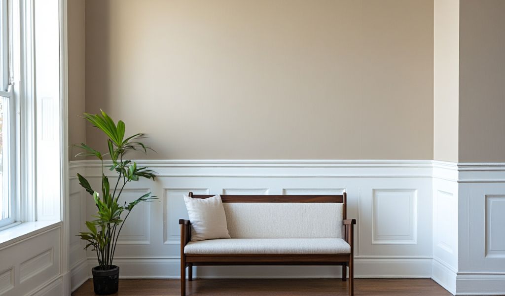
Before we delve into the colour placement, let's first explore the purpose and significance of the dado rail. A dado rail, also known as a chair rail, is a horizontal decorative element that runs along the walls, typically at around 30 to 36 inches from the floor. Its primary function is to protect the wall from furniture and chair backs, but it also serves as an architectural feature that can add depth, texture, and visual interest to a room.
When it comes to the placement of the darker colour in relation to the dado rail, there are two schools of thought:
Placing the darker colour above the dado rail can create a sense of depth and drama in a room. This approach can make the space feel more grounded and sophisticated, with the darker hue serving as a bold backdrop for the lighter colour below. This design choice is often favoured in traditional or formal settings, where a more stately and elegant aesthetic is desired.
Alternatively, positioning the darker colour below the dado rail can have a different effect. This approach can make the room feel more cosy and intimate, with the darker tone providing a warm and inviting base for the lighter colour above. This design choice is often preferred in more casual or contemporary spaces, where a more relaxed and welcoming atmosphere is the goal.
When deciding whether the darker colour should be above or below the dado rail, there are several factors to consider:
In larger rooms with ample natural light, the darker colour above the dado rail can help to balance the space and create a sense of grandeur. Conversely, in smaller or dimly lit rooms, the darker colour below the dado rail can make the space feel more cozy and intimate.
The architectural style of your home can also influence the placement of the darker colour. In traditional or period-style homes, the darker colour above the dado rail may be the more appropriate choice, as it aligns with the overall aesthetic. In modern or contemporary spaces, the darker colour below the dado rail can complement the clean lines and minimalist design.
Ultimately, the decision of where to place the darker colour comes down to your personal preference and the overall design vision for your space. Consider your own style, the mood you want to create, and how the placement of the darker colour will impact the overall look and feel of the room. Our personal preference though? We think that having the darker colour below the Dado Rail is the better choice (although it will look fantastic either way)!
At MR Mouldings, we understand the importance of making the right design choices to elevate your home decor. Whether you choose to place the darker colour above or below the dado rail, our premium decorative mouldings can help you achieve the perfect look.
Make sure you partner them up with the perfect Skirting and Architrave while you're at it!